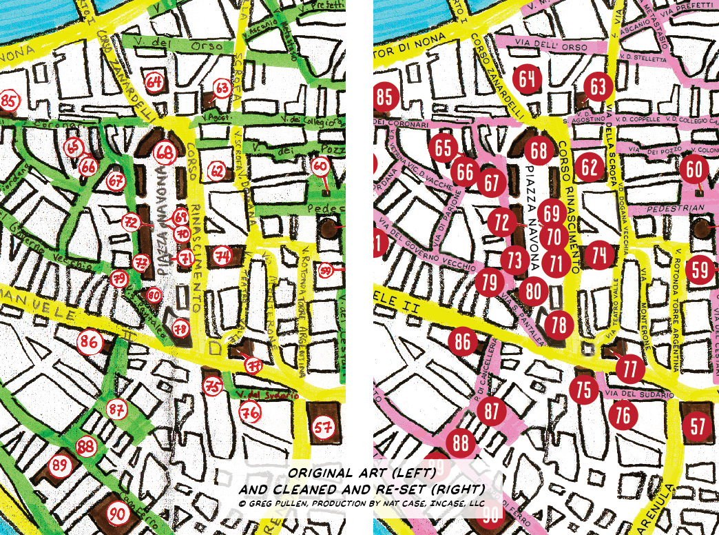
For Due Centi Luoghi, Greg Pulles built a map of central Rome by hand. It had the right feel for the book: detailed, but definitely hand-made. Unfortunately, scanned hand-drawn type doesn’t reproduce well, and the map needed some cleanup from smudges and patches. So I removed text in Photoshop, cleaned up the smudged areas, and re-set all street names in Illustrator, to give it the maximum clarity. Some additional street names were added and all were checked against local sources.
The font was an interesting question: how to get clarity with hand-drawn qualities? I ended up going with a comic book lettering font, Manly Men, from Blambot!. I’ve been interested for a long time in the kind of lettering I associate with early-twentieth-century architectural renderings, and this works well for that.