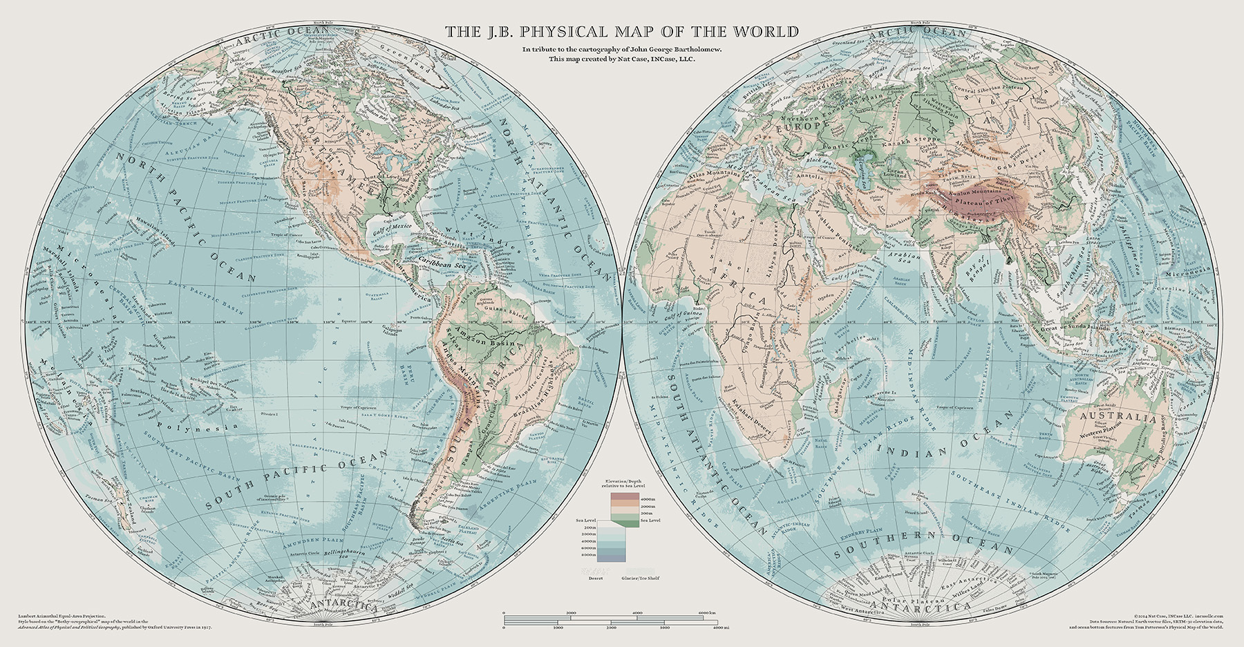
As I’ve discussed elsewhere, I’ve long had a love for the cartography of the great Edinburgh-based map firm of John Bartholomew & Sons, especially under the supervision of John George Bartholomew, who lived from 1860 to 1920. This was the early days of color printing, and registration between ink colors was not easy to achieve: each color ink had to be run through the press on a different pass. The printing done by Bartholomew’s was superb for the time, but it was still advisable to keep all the fine artwork on a single black plate, and then use colors to add texture. This also meant you usually only needed to revise artwork on one plate.
This map is based on a map in the 1917 Advanced Atlas of Physical and Political Geography, published by Oxford University Press for school use, with maps by Bartholomew’s. The map in question is the “Bathy-orographical” map of the world, done in what is now an unusual projection, but was relatively common at the time. My map has many more place names, using linework and placenames from Natural Earth, with ocean bottom placenames from Tom Patterson’s Physical Map of the World. One other feature of the older style was a much greater use of not-straight type, so I set myself a goal of no straight lines of text on this… there are a handful of exceptions, but mostly I stuck to it. It really changes the fluidity of the image, I think… but it took a lot of work to re-set all the automstically-placed point labels.
This map is featured in the 2014 Atlas of Design.
The map is available in print form, 36″ x 18.75″ for $50 or 48″ x 25″ for $70 (including shipping in the USA). For information on how to order (payment via PayPal is preferred), contact me here.
Click on image below for larger image.