I was asked by National Geographic Partners to help develop four of the thematic map two-page spreads in the new 11th edition of their flagship Atlas of the World. Though I was given some guidance, it was up to me to to propose and develop a plan for each that would be engaging, balanced, well backed up by sources, with some graphic variety. The basic template for each spread was one large map (which could include relatively complex data) and four smaller graphics, mixed between maps and other forms.
For the Economy section, I really couldn’t get away from the central global divide between haves and have-nots, but I wanted to show more texture. Fortunately we were able to get data for GDP that was broken down into sub-national units, and this allowed a more subtly gradated map of the global economic activity.
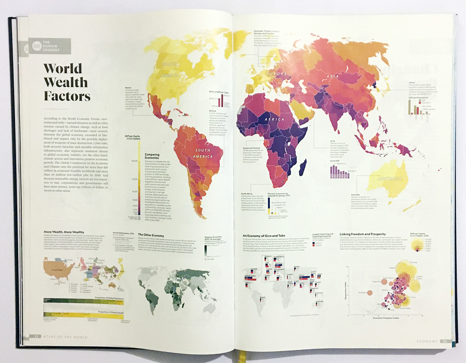
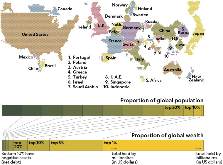
I included a cartogram, showing concentration of the world’s US-dollar millionaires. It was one of three cartograms I made for the atlas, and I discussed the technique of making them at NACIS 2019.
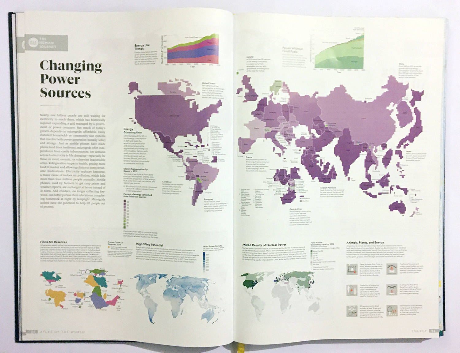
For the energy section, the centerpiece is a cartogram showing total energy consumption, with tints showing percent fossil vs non-fossil sources.
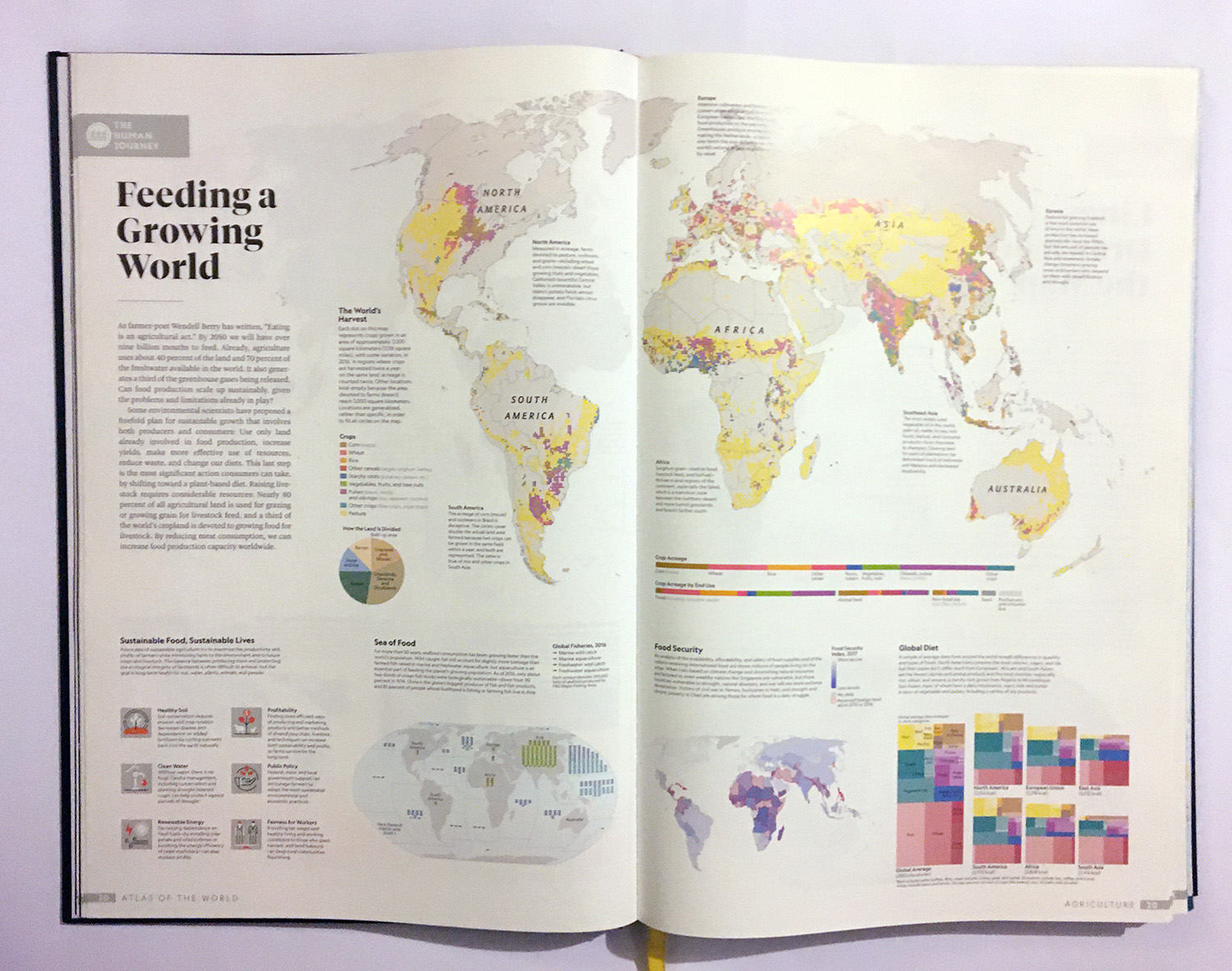
In the food section, I worked with Jonathan Wyss of Beehive Mapping to come up with a map showing land use for crops and pasture… it’s really a staggering amount of the earth’s surface. In the lower right is another interesting exercise: a set of tree-maps showing the proportion (by caloric value) of different kinds of food in average regional diets.
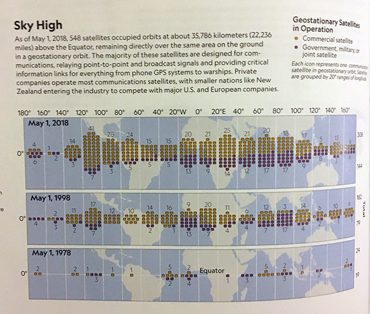
The last section was on “connectivity” and my favorite piece here was a map showing how fast the proliferation of satellites has happened, and how geostationary satellites cluster over high-value parts of the world:
“In the front of the book are 20 plates that show different data sets of humans’ changing adaptations of the world, whether it’s global urbanization, changes to fresh water sources or biodiversity, or patterns of global migration and implementation of communications connectivity. These plates are extremely well done and combine geography, statistics, and data visualization to provide a striking amount of information. A source list of where all of this data was collated is provided at the back of the book for students or researchers wanting to dig deeper into a particular topic. These plates by themselves would have been a worthy volume, and they really set the stage for the rest of the atlas.”
– New York Journal of Books, review by Jerry Lenaburg